Project Overview
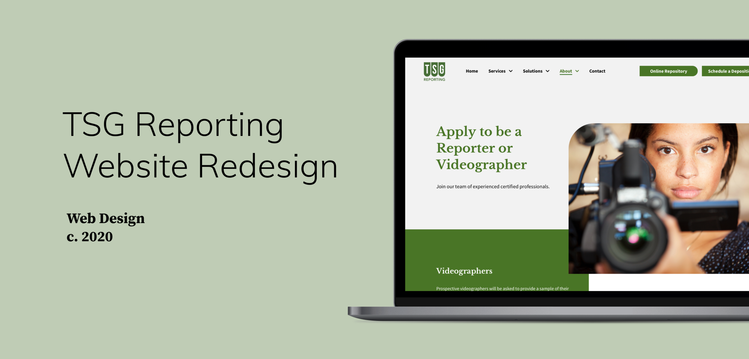
Designing a modern website that helps establish TSG’s brand identity, enhance brand reputation, improve internal conversation, and attract a new generation of customers.
About the client
TSG Reporting is a company that conducts remote depositions services. They provide services for deposition, hearing, and arbitration needs to law firms and corporations across the globe.
My Role
Main UX/UI Designer, researching and executing the end-to-end design.
I collaborated closely with a senior designer in the branding workshop, worked closely with PM, content strategist, developers, and client stakeholders.
Duration
One month
Tools I Used
Sketch, Abstract, Invision, Figma
Keywords
UI Design, Art Direction, Style Guide, Web Design, UX Design
Problem
Old site:
No visual hierarchy, unnecessary information overloaded.
Light on the actual content and details of what TSG does/provides and TSG's value - full service, the users couldn't find what they want to know and abandoning the site.
Low conversion rates, not mobile-friendly. No path for employee recruitment.
Process
Establish Brand Identity
We started off by conducting competitive analysis with the clients to identify competitors’ strengths and weaknesses.
To establish a unifying brand identity, we conducted branding and creative workshop with the clients to review and discuss their existing brand materials, set brand personality, voice and tone, value propositions.
Value - Trustworthiness, confidence, and customer first.
Tone - Professional but not overly formal, straightforward, succinct
Voice - Inviting, friendly, accommodating
Create Better Information Architecture to Sync with Team and Client
I conducted an in-depth web audit, which uncovered accessibility issues, confusing information architecture, and inconsistencies.
To set a common understanding of information architecture for the team, I created and iterated on the sitemap & lo-fi wireframe.
I also created different visual styles to test with stakeholders to ensure we were going in the right direction.
Solutions
Clear navigation for different types of users: customers and prospects, employees and prospective employees.
A complete declutter and re-emphasis on the website contents while improving SEO performance and enhancing the overall experience.
With a modern and simplified visual style, the site provides sufficient details for potential customers on TSG’s value proposition - services/solutions, which invites audiences to explore depending on their own needs(brief descriptions vs. full detailed page).
The Design
The style was inspired by the stenograph machine as well as TSG’s logo.
I achieved the final look by combining big fonts, spacious editorial layouts, clean & bright imagery, and geometric shapes to create a straightforward and friendly feeling. Applying stenograph keyboard shape as a consistent visual element to buttons and images helps strengthen TSG’s brand.
I created the web style guide (AA+ Compliant) and reusable design components to save efforts, which also ensured design consistency.
Note: Not the actual style guide deliverables
Thanks for reading


