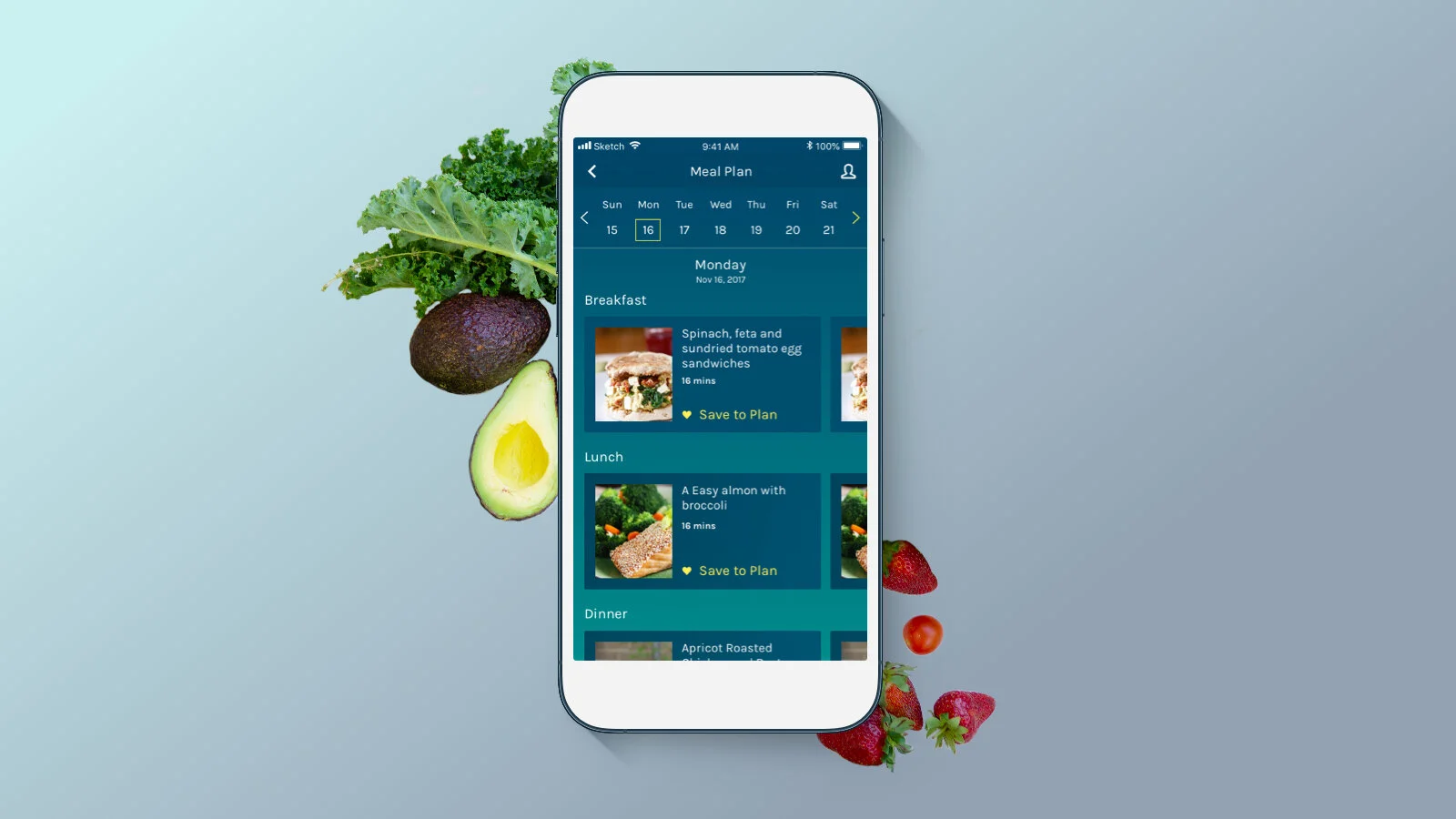
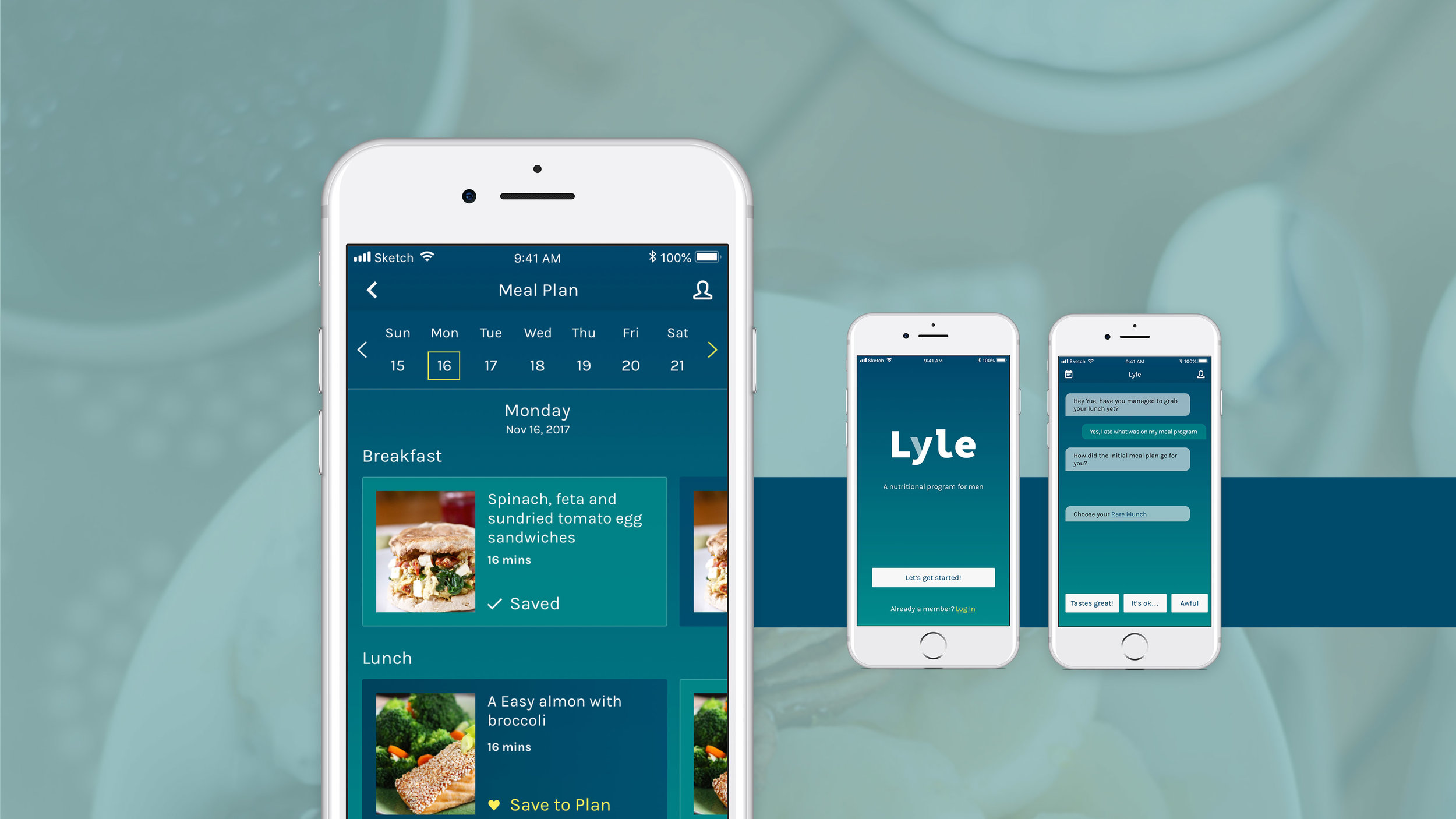
Lyle
An AI Weight Loss Coach for Men
Project Overview
Diet matters more than the exercise in weight control.
Lyle is a nutritional app for men. It's an AI-powered personal coach that guides daily meals to help men eat balanced to lose weight.
Keywords
UX/UI, Product Design, Conversational AI, Personal Nutritional Consultant
Client
My Role
UX/UI Designer, in collaboration with the Product Manager, Developers, Brand Designer, and Nutritionist. Throughout the whole process, I did ideation and strategic design, user research and competitive analysis, UX and UI design.
Tools I Used
Paper, Balsamiq, Sketch, Illustrator, Photoshop, Invision, Zeplin
Project Duration
October — November 2017
DESIGN PROCESS
RESEARCH
Cognitive Walkthrough
Lyle already got the 1st-version prototype when I got in touch with them.
I conducted cognitive walkthrough to evaluate the usability of the app, analyze its user flow and functionalities.
Results:
The app features and design didn’t achieve the business goal.
The general user flow is smooth. I didn’t get stuck in the process.
Some signifiers and feedbacks are very confusing on the interface.
The branding and visual interface of the app needs to be redesigned.
Project Goals
With the cognitive walkthrough results in mind, I conducted a second round of interviews with the stakeholders, including product manager, brand designer, developer, and nutritionist. I analyzed the scope of the project, and design challenges based on the product strategy
PHASE1
Act as a personal nutritionist. People who use it do not need to worry about planning their meal. They can simply follow Lyle's instructions.
Help customers reach their ideal weight.
Continuous customer engagement to sustain a healthy lifestyle.
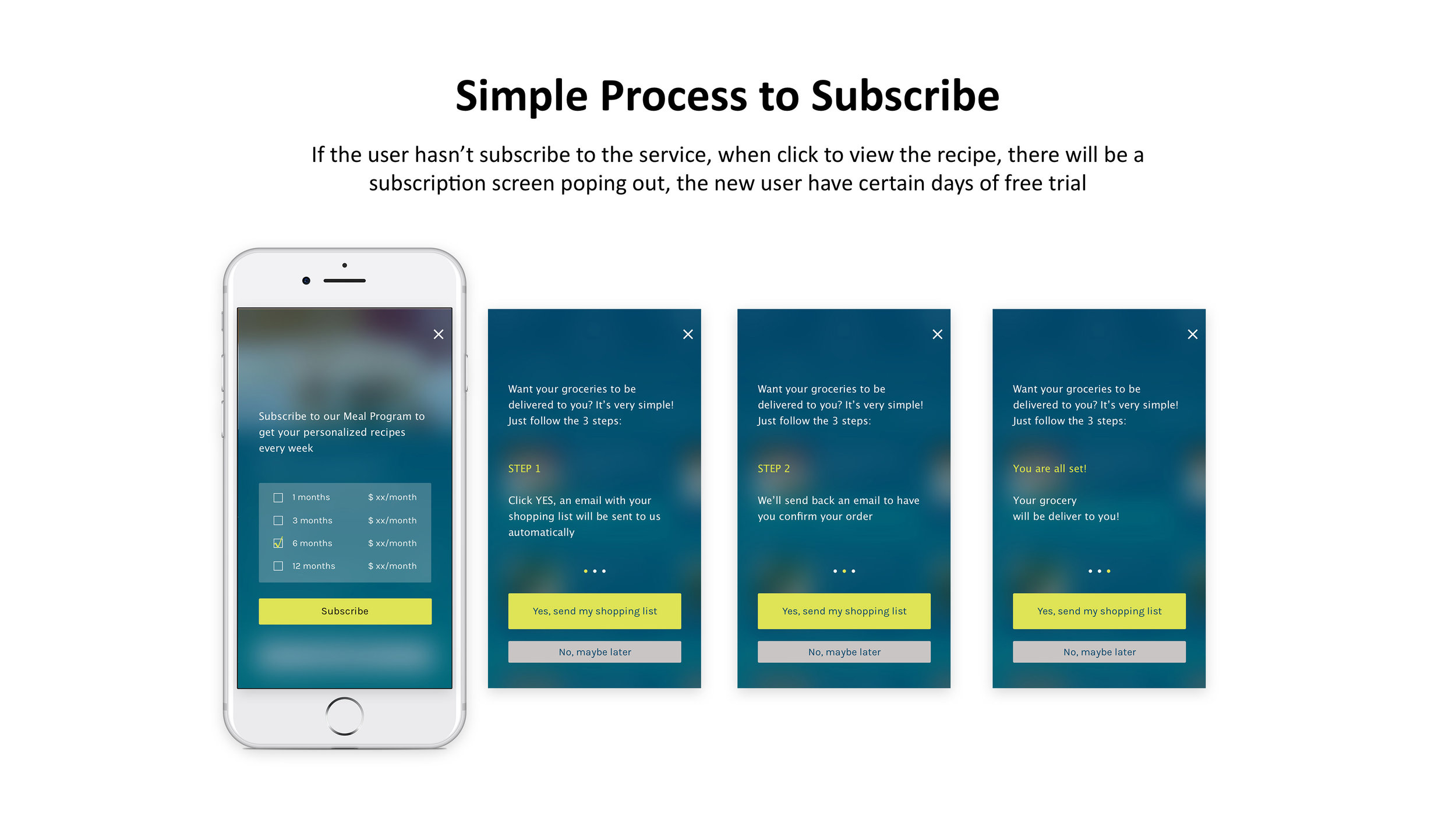
Motivate users for meal plan subscription.
PHASE2
Grocery Delivery Services
Design Challenges
What should be the main screen for the app, what elements should be on the main screen?
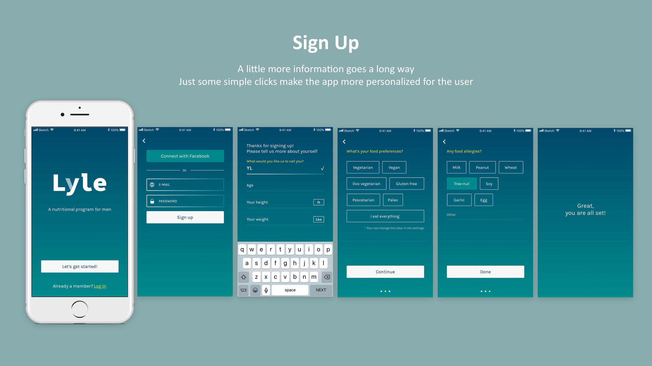
How might we collect detailed user information effectively during on-boarding?
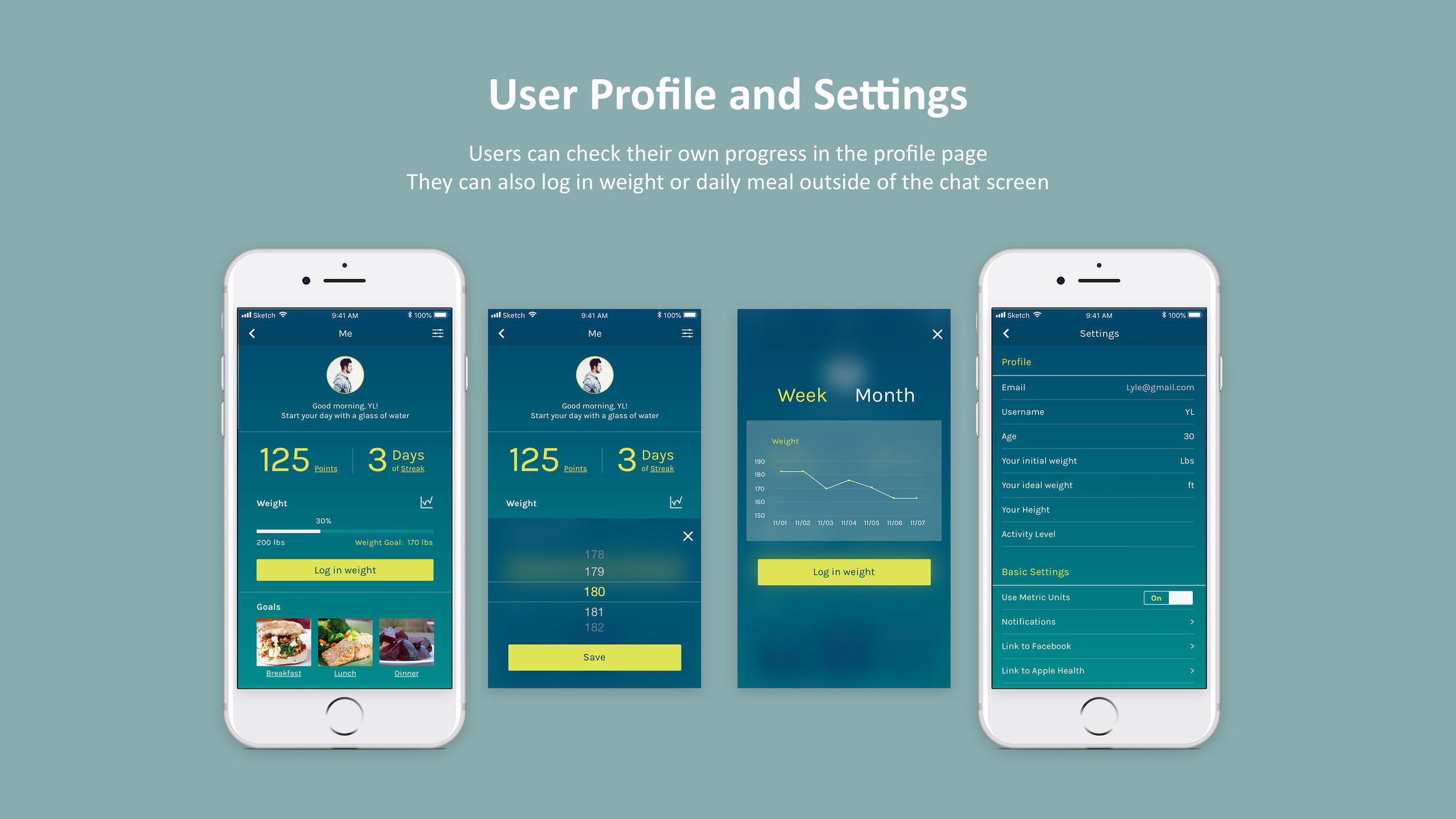
How might we evaluate and present user’s progress towards the end goals?
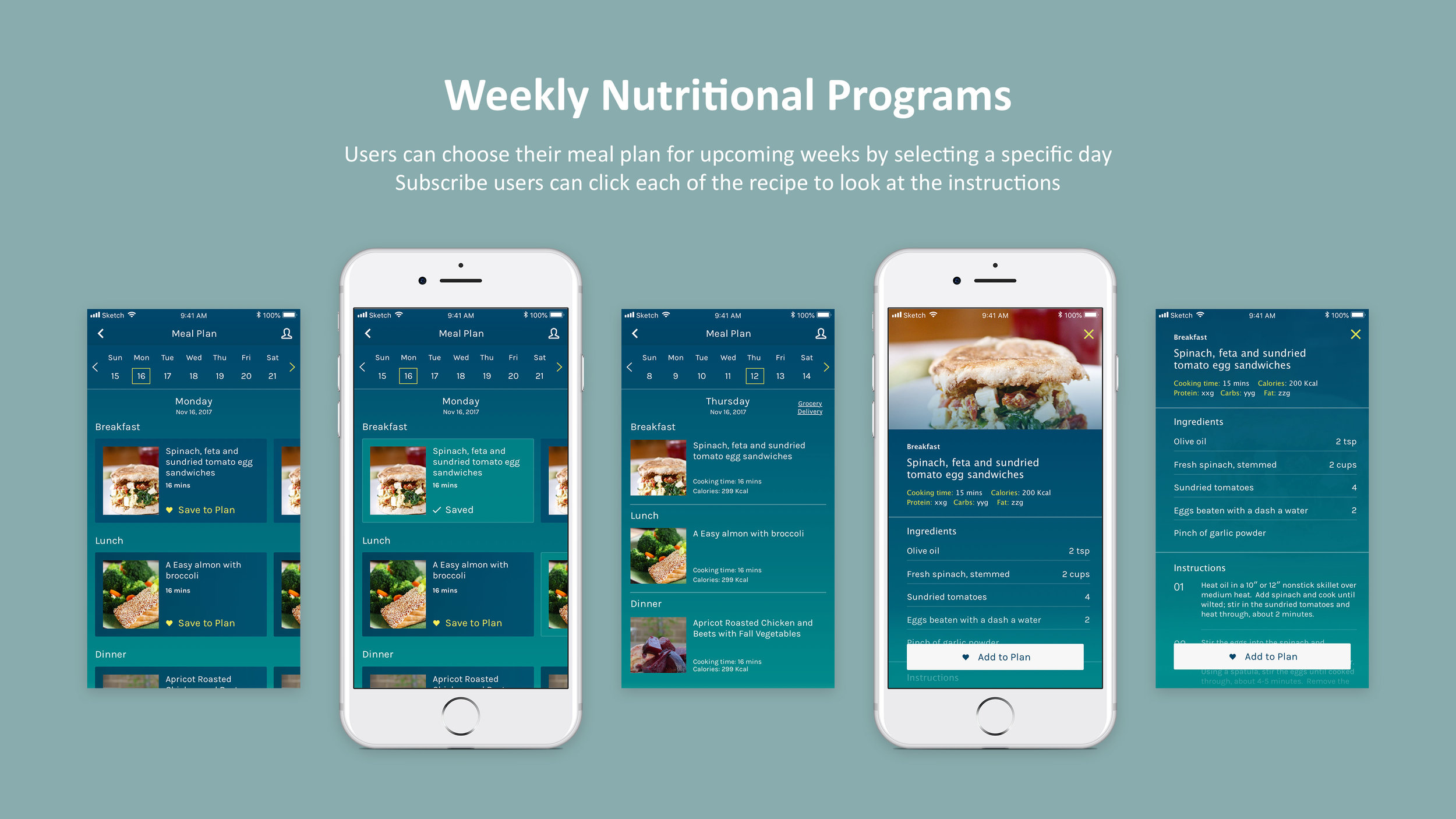
How to design the meal plan, so that users can not only see it as guidance but also actively engage?
Users’ Pain-points
For marketing research needs, the project manager made several persona based on their target audience research
I categorized the pain-points as the following to further guide my design process:
Hard to remember/calculate the calorie
If keep calorie in mind, daily meal is usually the same and boring
Busy routine due to travel, not enough time for gym or plan meals
Competitive Audit & Exemplar Research
I conducted a round of competitive analysis(NDA) within these domains:
Nutritional app | Conversational AI | Habit Forming | Personal Health | Meal Plan
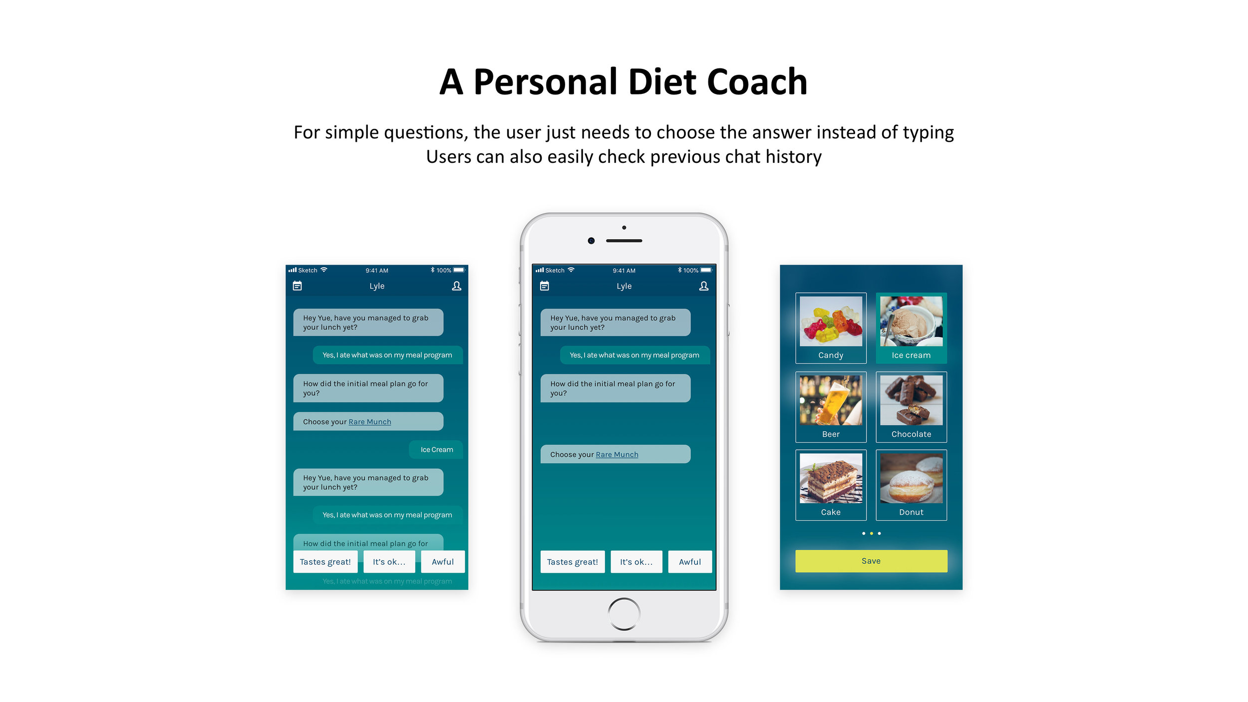
Then I did exemplar research on conversational AI, based on the research, I categorized several main interactions/features that are popular in conversational AI:
Button for Simple Choices | Text Input | Simple Forms | Suggestions made based on conversations Chatting history
DESIGN
Task Analysis
Based on Lyle’s previous research, I drew two paths to show how the user engagements can align with Lyle’s business strategy
Sitemap
Wireframes
After I made a basic structure for the functionality of the map, I drew rough prototype on paper, then digitalize it in Balsamiq. This is the 1st version prototype, I made several iterations after this, based on internal user testing results.
Testing and Iterations
I made several iterations on the wireframe, and some others directly on the visual design. Here are two of the main ones.
Testing
Hotspot for Interaction - People don’t click on this often since they can access meal plan from the conversation
Iteration
Move menu to the top of the screen, leave bottom part for more frequently used interactions such as button choice or text input.
Testing
When going into the meal plan, what users see immediately is their progress, they are confused about where to find the recipe.
Iteration
Instead of using a whole calendar view, I put the calendar on the top, and display recipe for that day.
Branding
I worked with the branding designer, designed three sets of interface styles with different variations on each based on Lyle’s branding color. We eventually decided to go with the one that gives a sense of active, yet not too colorful.
FINAL OUTCOME
Lyle makes it easy for users to
[Free membership] Chat with Lyle for free, and keep track of their progress
Choose from different subscription plans
[Members] Get personalized healthy recipes every day, choose a recipe for whichever meal they want and keep track of their progress.
Interactive Prototype
Asset Export - StyleGuide/UI Library
After finishing the design, I exported all icons and buttons, created color palette, then updated the final design with team members using Zeplin.
LEARNING
Future steps
Refine user research and persona
Redesign the rewarding system. It’s not encouraging and clear enough.
Redesigned goal section to reflect different stage goals.
Put more focus on grocery delivery functions.
Project Learning
Learning about the business goal for each stage helps create a strategic plan for an MVP
Need to Set up the KPI to properly evaluate the success not just from a user experience point of view, but also a business point of view.
Need to update knowledge about iOS app design guideline
Actively engage stakeholders and users, test and get feedback in the early stage can save a lot of effort
